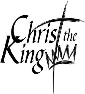
 idea we are considering. How does it strike you? What does it suggest about the church on whose sign or literature you see the logo?
My impressions:
1. I want to move the crown down a little so that it doesn't appear to be another word. (A couple people thought it was a continuation of King, as in, perhaps, "Kingdom".
2. I want the white part of the crown to be solid white so that the cross doesn't show through the crown.
3. I'm not sure about the font. Another font might work better with the graphic.
What do you think?

4 comments:
Here's my initial reaction:
1. The visual hierarchy (where my eye goes first, then second, etc.) causes my eye to go to the cross element first, then I have to go back to the left to read it. This may be slightly uncomfortable for readers because we naturally read from left to right. It goes against the natural flow.
2. The crown currently reads as M's, and the gestalt of that line makes me want to read it as "Kingdom".
3. There is a visual conflict between the intersection of the C and the K vs. the cross element.
4. If you were to try another font, perhaps a more formal font would allow a greater contrast between the text and the graphic element. The font Trajan Pro might work.
5. I understand why the crown is there, but as it is, I wonder if it competes with the cross, visually.
I'm a professional graphic designer and have design many logos. I'd be glad to offer more input if desired. If not, that's cool too.
Gary Means
blessedare@hotmail.com
Just for fun ... what if the crown were gold or a marigold color, or what if the cross was crimson?
I too saw the crown as an "m" and was trying to figure out why they left the o out of Christ the Kingdom.
Count me in as one who was confused by the "mmm" that is actually a crown. In addition, if you don't automatically recognize the cross as also representing the letter "T", then you would read "Chris the King."
Final thought - why is the crown at the bottom of the cross, rather than at the top? Does it make a theological statement about which is more important?
Post a Comment